
Hi, I’m Dunna from the YouTube channel Dunna Did It. I teamed up with Storyblocks to swing by and show you a few tips and tricks that you can use to enhance the color quality of your next video. Today we’re going to go through 5 ways for you to step up your color grading and make your videos stand out.
Enhance the Color Quality of Your Videos
Tip 1: Use curves to change the lighting in your scene
Okay, first things first. Understanding your tools is super important. So in whatever software you’re using, make sure that you take some time and learn the specific tools that are available to you. This is going to make your life a hundred times easier, so you won’t have to look at a piece of footage and get stuck thinking, “I really want to fix that, but I’m not sure what to do with it.”
Specifically, one of the most powerful tools to enhance colour quality that exist within most color grading and video editing software is the curves. Curves are one of the best ways to change the look of the lighting in your scene. Curves are basically a graph of input versus output – almost like a before and after. The bottom left is all black and the top right is all white, so if you take your point at the bottom left and start dragging it upward, you’re taking what was black in the scene to start with and making it brighter. If you take the point in the top right and move it down, you’re going to be making the whites in the scene darker.
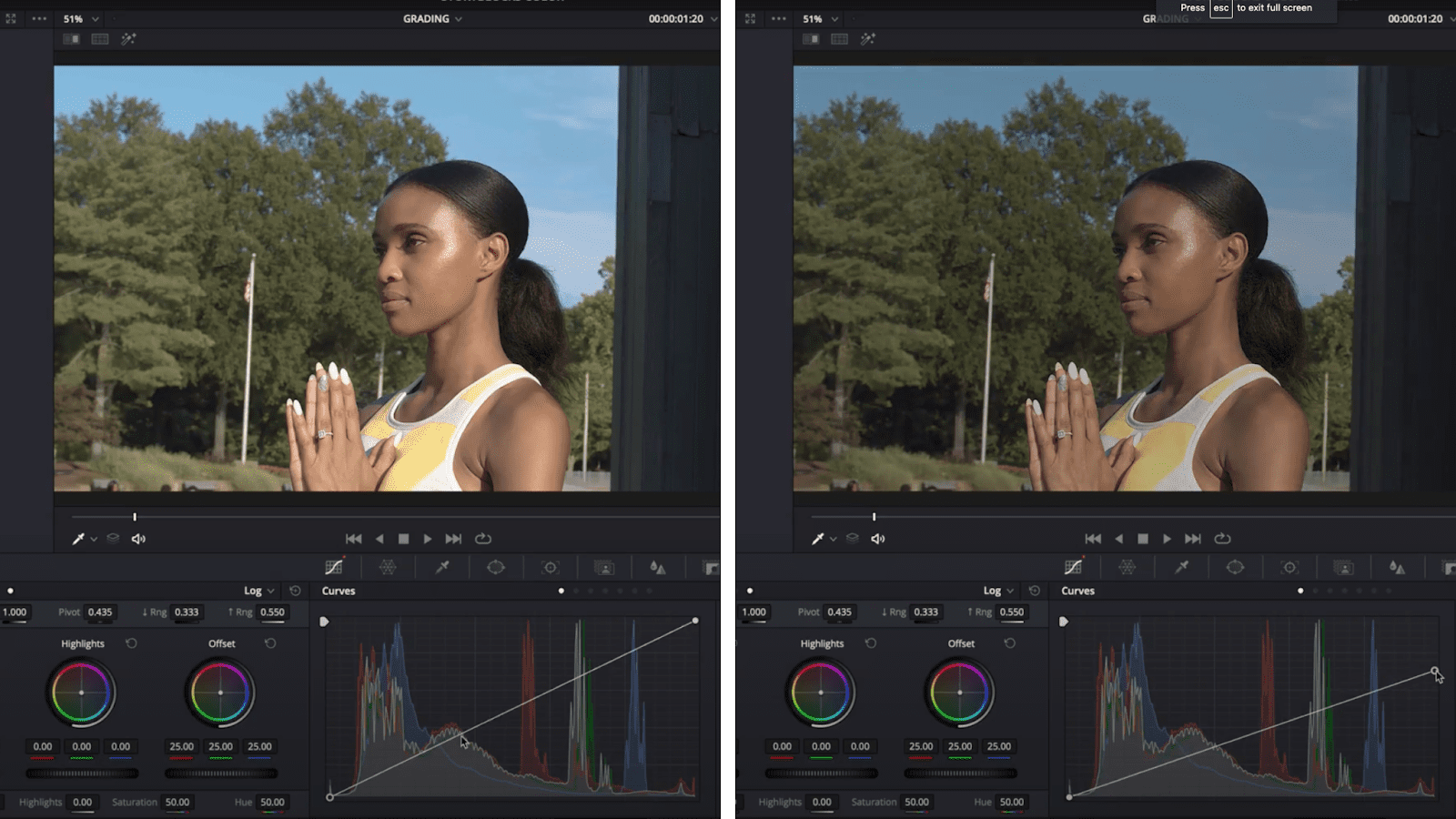
But the magic starts when you start to put points on your line. If I add a point in the middle and drag it down a bit, I can make everything in the middle darker while leaving the white and black points alone.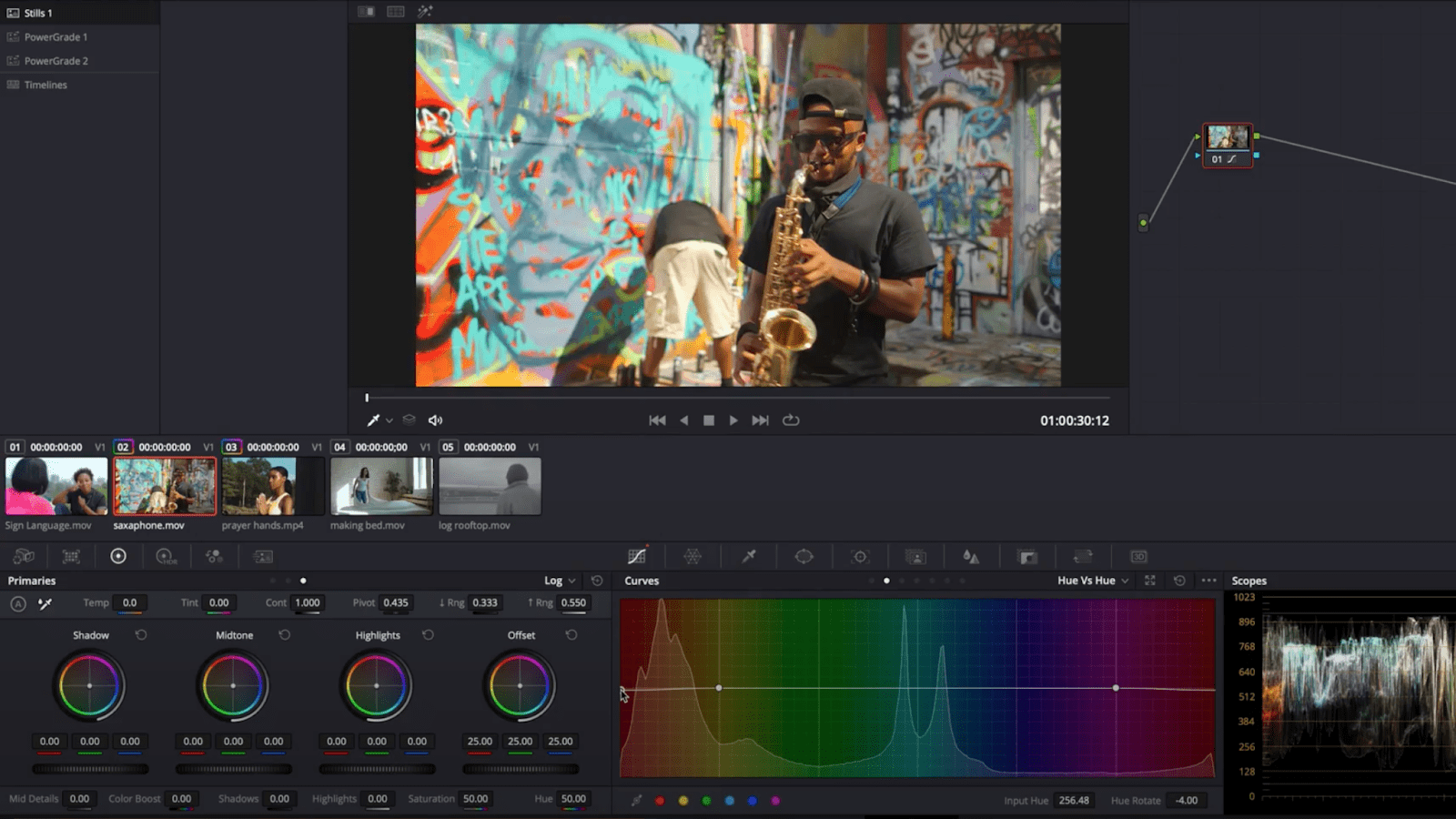
The great thing about curves is that you get full control. If you want to increase the contrast, create an S curve and bring down the dark parts while enhancing the brighter areas. If you want to decrease the contrast, flip the S the other way. Be careful though – if you make your adjustments too intense or too steep, you might break apart the footage and impact the final result.
A cool trick that you can use if you want to create a bit of a film look is to slightly fade your blacks by creating a point close to the black point and pulling up from the very bottom. But moderation is key! If you go too far, it can look bad.
Tip 2: Play with Hue vs. Hue
One thing that I find gives my footage a stronger look is being selective with the colors that I choose to stand out by using the hue, saturation, and luminance (also known as HSL). There are two little tricks that I like to use. The first is to go to hue vs. hue – this is where you pick a color and change it to another color.
What I do here is shift some of my colors closer together. I make my reds a bit more yellow, my yellows a bit redder, my greens a bit bluer, and my blues a bit more green. I find that it’s subtle, but there’s something about it that makes the picture more simple and pleasing in its color.
Tips 3: Play with Hue vs. Saturation
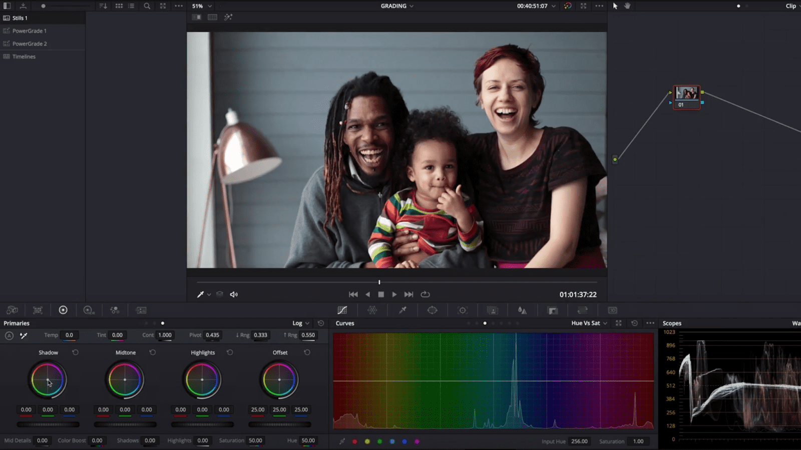
The other trick I use is hue vs. saturation, which is where you can pick colors and change how saturated they are. I saturate everything except for a few colors that I feel like really represent my scene. Quite often, the colors that I leave with more saturation are the skin tones, which are kind of orange and red, and sometimes it’s either the blues or the greens, depending on the scene.
The reason it often ends up being these combinations is because they’re nice and complementary to each other, which leads us to my next step – adding color contrast using the color wheels. Generally, if we look at the color wheels tool, we’ll see the shadows and mid-tone highlights connected to three circles of color. If we move the point towards the outside of the circle, we can add more of that color into that specific part of the image, enhancing color quality.
The way that we add color contrast is by adding complementary colors into different parts of an image. Complimentary colors can mean a couple of different things, but in its simplest form are colors on the opposite side of the color wheel. So for example, a classic contrast is putting teal into the shadows and some orange into the mid-tones, we get the color contrast between those two parts of the image.
You could go with greens in the shadows and pink in the highlights – whatever you want. The possibilities are quite endless, but if you were to take a look at any of your favorite shows or movies, you might notice a tendency towards two or three colors that really stand out. This technique is likely how they’re achieving that. Play around with different combinations of colors and see what looks best for the mood that you’re trying to get across with your footage.
Tip 4: Make the footage look normal with white balance and exposure
Okay, so we have all these cool tools to make our footage look interesting, but the fourth tip is more about the process of color grading and has made the difference between really frustrating grades and nice, easy grades for me in the past. The fourth tip is to correct and then grade.
What I mean by that is that you want to get the footage looking normal first. For some footage that might mean fixing the white balance of the shot first or changing the exposure. For other shots, depending on where the footage came from, it might be a full conversion from a flat or log picture profile. This is your color correction phase, and it’s really going to allow you to get a good starting place for all the other tools that we talked about earlier.
Tip 5: Start with color-correcting & then color grade
After you do your color correction, you can then do your color grade. This is important: you want to do this on another layer, with another instance of your color grading effect, or another node.
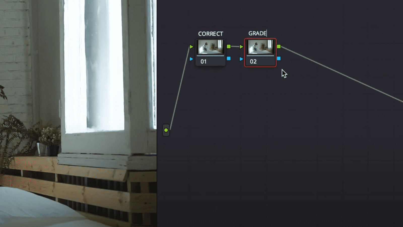
So in Premier Pro, this would look like adding another Lumetri color effect after the first one. In DaVinci Resolve, that would be another node. In Final Cut Pro you can add more color grading effects after each other. Basically what this means is that you’ve created a nice neutral starting place so that the parts of your image that are black, white, mid-tone shadows, and highlights are different from what they were originally. Another advantage to working in this two-step system is that if you have the correction phase right for all of your shots, you should be able to apply similar color grading to all of them to get a consistent look throughout your video.
Now is the fun part: practice. I highly recommend grabbing some footage from Storyblocks and seeing what you can do with some of the tips I showed you here. Again, I’m Dunna from the YouTube channel Dunna Did It – thank you so much for hanging out with me and diving into the wonderful world of color grading!