
Ever visit an Instagram page that looks like all of its posts were created by the same person on the same day with the same equipment? While it certainly could be one person, because Instagram is something maintained over time, variables inevitably come up along the way. And variables are a good thing—you don’t want all of your posts to look exactly the same. So how do you discover an aesthetic, then maintain it without being boring? Keeping up an aesthetic comes down to defining it and creating a set of written guidelines for yourself and/or your team—a style guide specifically made for Instagram. Even if it’s just you, write this stuff down!
Set the Mood of Your Instagram Aesthetic
The first step in creating a defined and consistent aesthetic is establishing a mood. How far along in this process you are will depend on if you already have an established brand. If you’re starting from scratch, begin by thinking of some adjectives to describe the look and feel you’re going for. For example: earthy, edgy, clean, colorful, moody, dramatic.

Next, you’ll create a visual representation of the look by making a mood board. This is useful for your own reference as well as if you’re collaborating with others. All you have to do is scour the internet and Instagram itself for images that encapsulate the mood you want.
A good place to start here is Pinterest. Create a board and start pinning things you like. Don’t worry about editing at first, just pin, pin, pin. The purpose of the first pass is just to mark anything you like. Another great tool for mood boarding is a presentation application such as Keynote, PowerPoint, or Google Slides. Simply screenshot inspiration imagery and paste them in. Finally, if you have a Storyblocks subscription, you can create a Favorites folder with your favorite images (and use them later).
As you’re working, you may notice that not everything you’ve flagged actually goes together. It might be helpful to make a few different boards for different directions you could take before zeroing in on a decision. Once you’ve finished with this exercise, include your final mood board and mood descriptors in your style guide.
How to Maintain Consistency and Color
How specific you get with color depends on how you want your feed to look and if you already have brand colors established. When taking and sourcing photos, look for and take images that match your colors. Using similar lighting conditions will also help with a cohesive look.
To further unify the colors, consider using the same image editing treatment or filter on all images. Apps like VSCO and A Color Story are great alternatives to the standard Instagram filters.
Vary Your Content Types
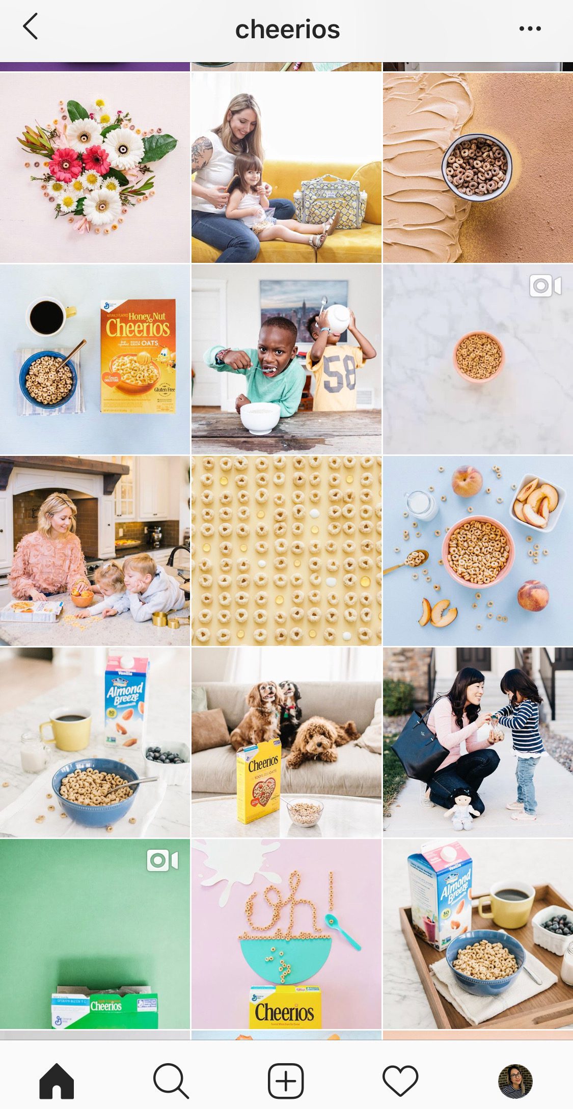
While the idea is to keep a consistent visual look, you’ll likely still want to include different types of images. Some with people, some without, some with text, etc. Think of the types of images you want to use and write them down in your style guide. To create visual balance in your feed, alternate the types of posts you publish. Cheerios creates visual balance by mixing up studio photography and lifestyle images.
Sleepwear brand Lunya does a great job of mixing up content types while keeping a theme. Their neutral color palette evokes a spa-like vibe consistent across their feed even though they use a lot of different content types. In the screenshot below they have:
- Text-Only
- Memes
- Travel
- Product Shots
- People
- Pets

Tools like Planoly can help you plan and visualize your grid before posting, so you know that everything will flow.
Sourcing Content for Your Feed
Creating a cohesive aesthetic on Instagram doesn’t mean that all of your content has to come from the same place. Some sources for imagery include:
- User-Generated Content
- Stock Images
- Screenshots
Write out a list of image sources to include in your style guide. Just remember when sharing images from other accounts to always get permission first, and credit the account. When using royalty-free stock images, however, no credit is needed. Let’s look at some photo-driven accounts that source all their photography from users.
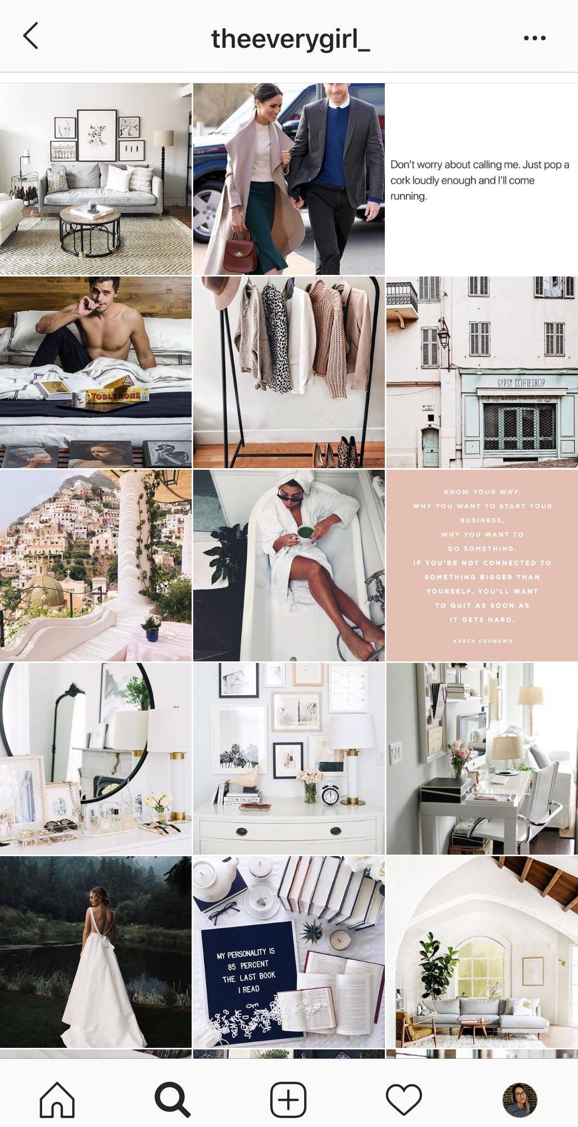
First up: The Everygirl. This feed is cohesive with clean lines and a black/white/blush color palette. They typically source images from popular influencers to maintain high image quality. Notice even when they used an image of Meghan and Harry, the selected a photo where the outfits match their page colors.
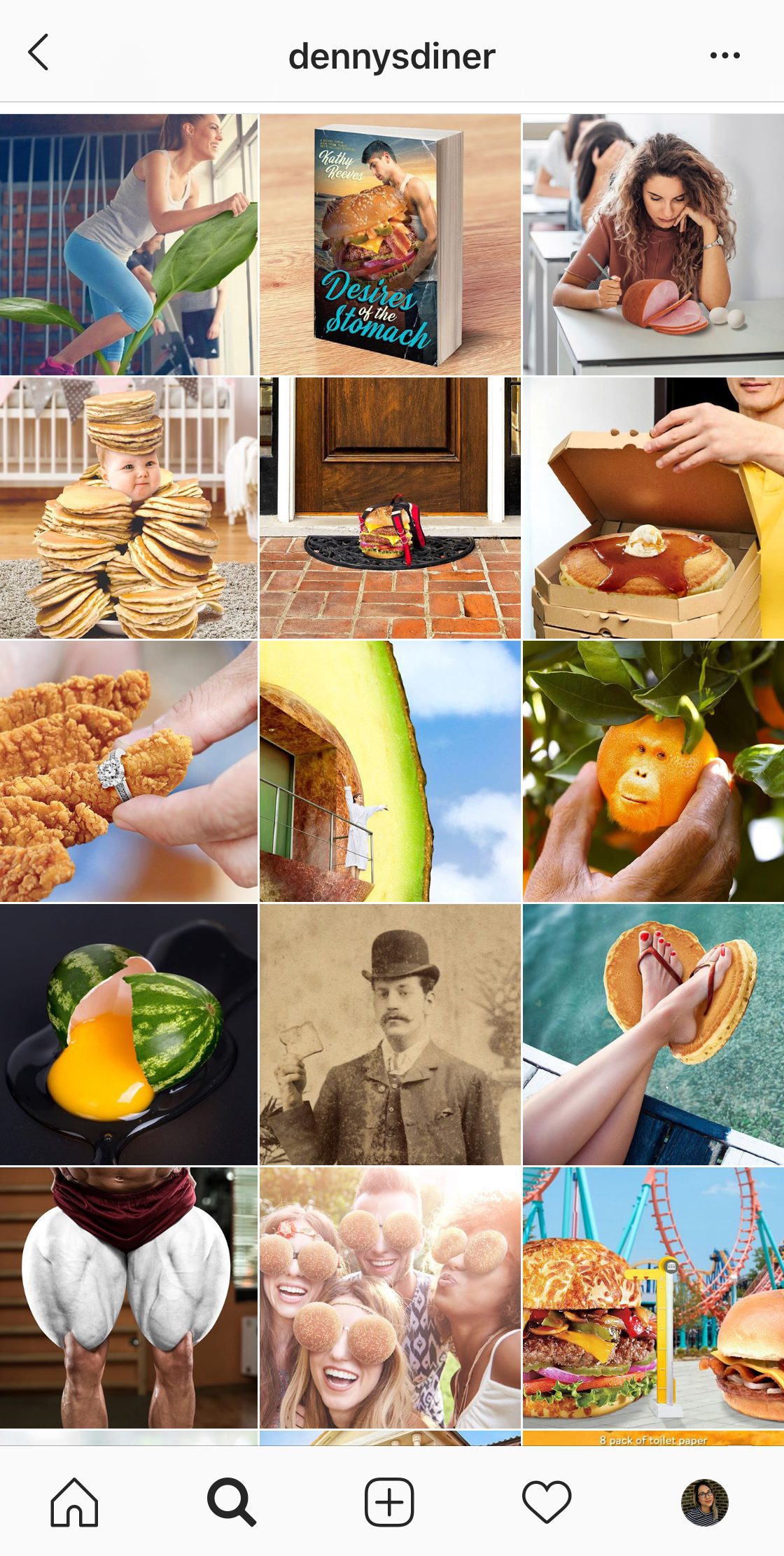
Denny’s uses stock photography to create silly scenarios paired with fun captions. The natural color palette is driven by their brand colors as well as the colors of their featured foods.
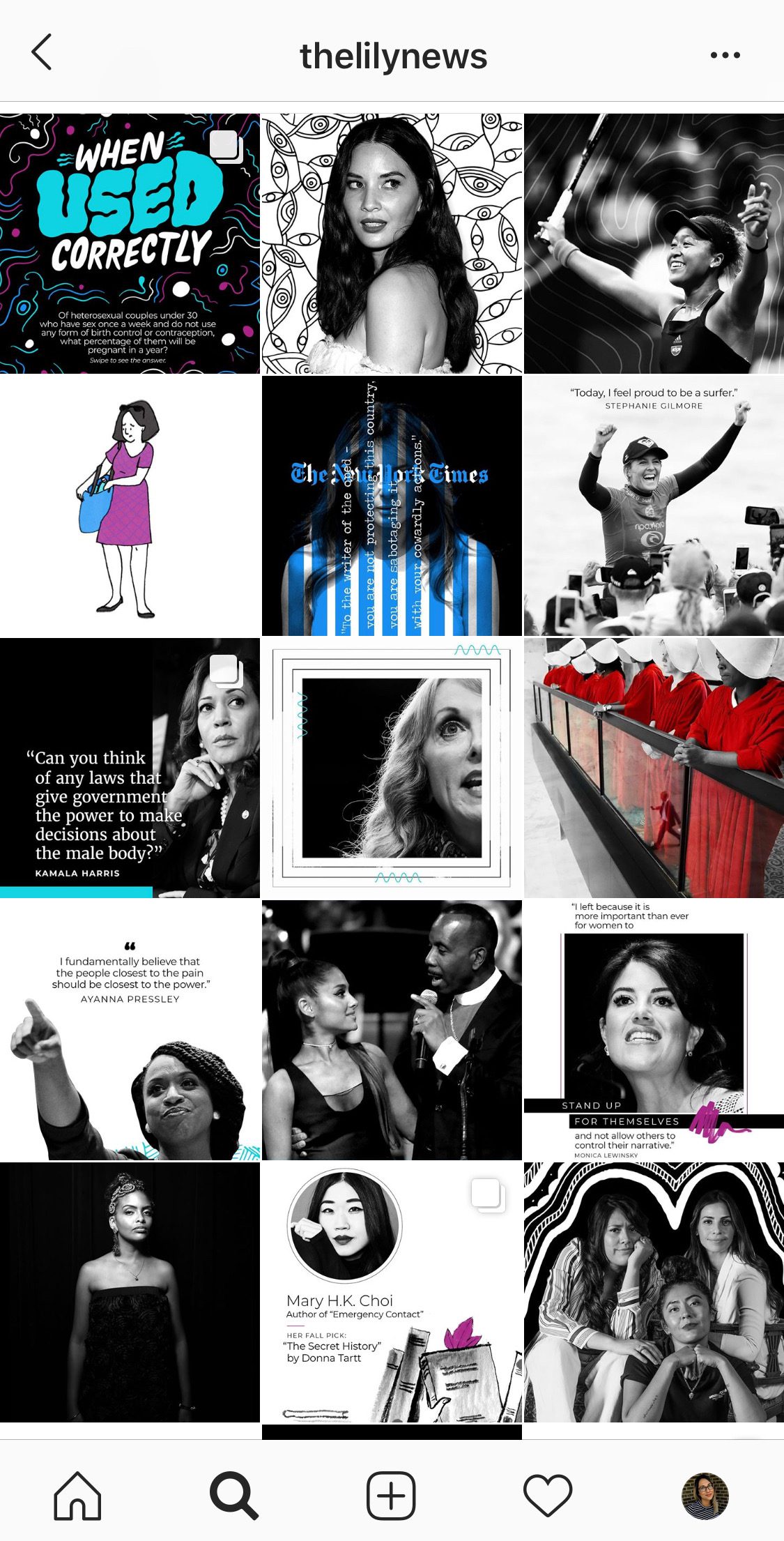
The Lily is another example of an account that achieves a look without taking any photos. They’ve simplified the color question by converting most images to black and white and adding in graphic elements with their brand colors.
Establishing an Instagram aesthetic is all about creating a set of guidelines for the account and following them. This way, you can take and source different content and still have it feel cohesive and interesting. It’s all about a balance.