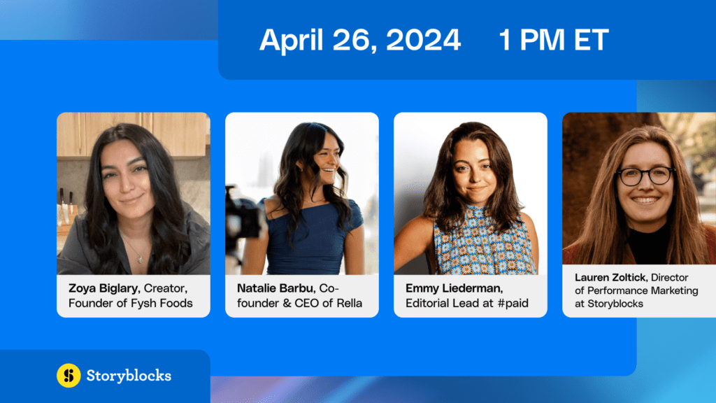
Trending This Week: Stained Glass Meets Mid-Century Iconography

Calling all designers and creatives! This is our first post in a new weekly series in which we highlight design trends and industry tips that catch our eye and inspire us to do what we do best: create cool projects with stock graphics. Our first choice to kickstart this series? A fun linear illustration reminiscent of stained glass windows—brought into the modern world. We came across designer Justin Pervorse’s label design, and instantly envisioned a twist of our own (featured below).
We won’t say linear icons are an overused trend because, frankly, we’re quite the fans. However, it’s greatly appreciated when we find new creative utilization of these bad boys, like Pervorse’s design. This stained-glass inspired trend involves a bright, bold color palette; minimal, linear icons; and mis-mashing them together in a mosaic, blocked-off fashion. Keep the icons you use on brand and on message—whether that’s funky and whimsical, or a little more polished and streamlined. We used our stock vectors to get the look.
Here’s our take on stained glass meets mid-century iconography:
The creative community is abundant with talent, and designers are cranking out awe-inspiring works of art left and right, week after week. As fellow creators, it’s our job to stay abreast of the hottest trends coming down the pipe, so we are constantly keeping an eye out for some amazing designs that push the envelope. So keep an eye out for our new weekly series—bringing you inspiration from the design community and the resources to make it happen.
Want to give the stained glass trend a whirl? Try downloading and experimenting with the minimal icons we used in our design.
![]() |
![]() |
![]() |
![]() |
![]() |
![]() |